Design
Development
Business
Framer vs. Webflow: Which no-code tool should you choose as a designer?
In my last article, I went over the recent explosion of no-code solution & tools - how this came about, and what it means for modern web designers. Now let’s take it a step further.
What does it take to implement a design in Framer and Webflow - two of the most popular no-code solutions? What do they have in common, where do they differ? Finally, which one should you go with as a designer beginning your no-code journey?
Read on to find out!
The task & my background
I started my no-code journey with a very basic understanding of HTML and CSS, but no background in front-end development above that. I made a conscious choice not to follow any tutorials unless I get completely stuck, instead trying to figure everything out on my own.
The task I set out for myself was simple: take this Figma design, and implement it the best way I can first in Framer, then in Webflow. Here’s what I learned in the process.
Webflow and Framer - key things in common
The key takeaway from my adventures is that the two tools are fairly similar when it comes to the basics:
- They function directly in browser, without the need to install anything (though there is a dedicated Windows and macOS application for Framer is that’s what you prefer);
- The UIs are fairly similar, so it’s easy to switch from one to the other (however, I liked Framer’s UI better in terms of simplicity, tidines, and ease of use). They’re also quite intuitive for first-timers;
- They give you the option to implement components from third-party suppliers (but again, the process is more nuanced in Framer);
- CMS integration is possible and works quite seamlessly;
- They allow defining and effectively utilizing reusable components;
- Both offer a free version with watermarks on the end product;
- They support custom code, though unlocking it is a paid feature in both cases;
- Both offer dedicated learning resources - Webflow University and Framer Learn.
However, once we dig a little deeper, some key differences become quite obvious.
Framer’s strengths
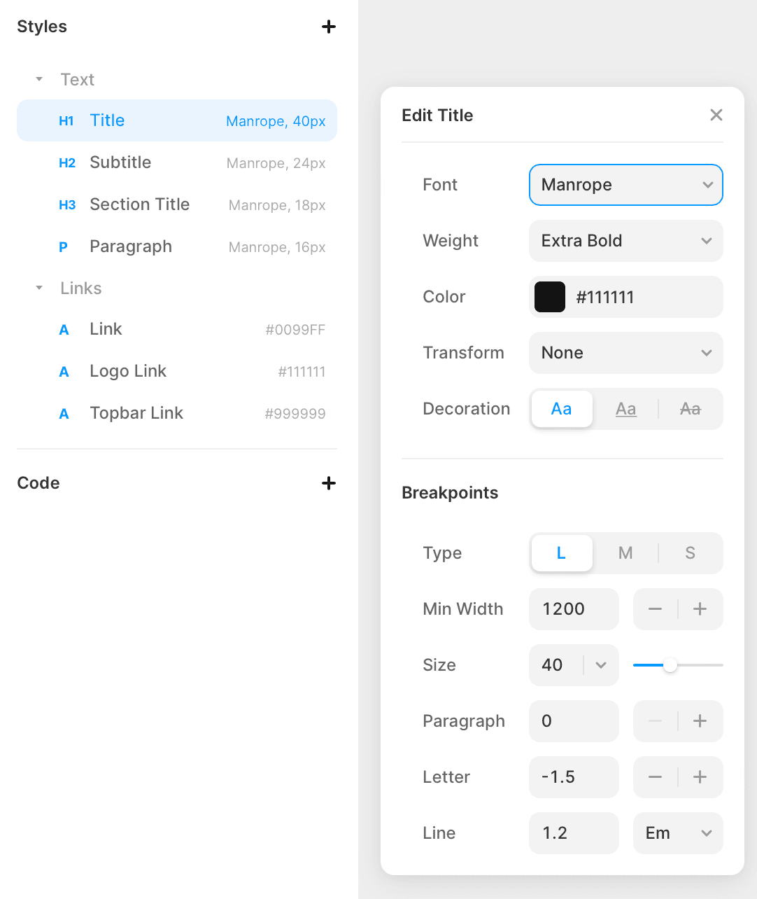
The first major difference I noticed is how much simpler and more intuitive Framer’s UI is. A lot of its general “niceness” can be attributed to how similar it is to Figma and Sketch in terms of its overall layout and logic of text styling, colors, etc. If you’ve spent some time on those apps, you’ll instantly feel right at home in Framer.
In a way, Framer feels like more of a Design than Development tool. Because of this, its barrier to entry will be fairly low for designers who have spent their entire careers strictly with vector applications, without dipping their toes in HTML and CSS.
 Case in point: Framer makes it easy to change styles of selected breakpoints without switching between them one-by-one. In Webflow, I needed to switch breakpoints every time and set, for instance, font sizes.
What I loved about Framer is how intuitively it approaches components and reusable elements. Every component, its variants and states have a separate dedicated subpage that’s easy to find and access. Adding a new one is super easy too - all you need to do is click an appropriately named field and use the “+” button.
Webflow’s strengths
Webflow is, as I mentioned before, not as intuitive as Framer. But to its credit, it also makes finding solutions to your problems as easy as possible. Its editor has a built-in tab with detailed guides (video + written form), so that you don’t even have to tab to Google to find the answers. The guides themselves are also much better than those offered by Framer Learn, which in essence are little more than just documentation.
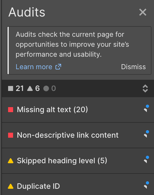
 Another cool Webflow feature is the page Audits. This function lets you know about all the little aspects that might harm your website’s SEO or accessibility, such as missing alt text for images. It was especially useful to me, a designer, who hasn’t developed the habit of filling them like a seasoned web developer would.
In Framer’s part of the article, I mentioned how much I loved its interface - but it doesn't make it a clear-cut winner. Webflow’s more complicated UI goes hand in hand with a much higher degree of customization the tool offers in comparison to Framer. True, its barrier to entry is higher, but once we overcome it, we’ll have a more powerful tool on our hands.
Webflow also has the advantage of offering a robust set of learning resources to guide you through the complexities: the Webflow University. While I, as a beginner, achieved similar results with both tools, this is not necessarily true in all cases. A Webflow power user will be able to accomplish much more than a Framer power user.
Webflow’s client-first methodology
The biggest obstacle I encountered while building my Landing Page in Webflow was the RWD implementation. Researching my issues, I came across the notion of client-first- a methodology by Finsweet, which completely abandoned accepting custom website designs from its clients in favor of simply implementing pre-built Webflow elements. If you’re curious about the reasons, have a look at Finsweet’s blog post.
Digging deeper, I realized that client-first methodology is the very essence of Webflow, and the only approach that guarantees the results I’d hoped for. So I started the whole process from scratch, applying the client-first principles (you can learn more about them here). Most importantly, I learned to use variables in global classes and class combos. They work pretty much identically to Figma’s variables - changing a style assigned to given components automatically changes it everywhere it’s used within the project.
The process of building the LP went much smoother the second time around. So, the biggest lesson here is not to try to figure out everything on your own as I did - take a look at the Webflow University guides first, which will smoothly lead you to the client-first methodology and its entire mindset. This will be doubly important if you’re not the only no-code designer/developer working on a given project. With everyone following the same methodology, it becomes that much easier to pick up where your colleague left off, as everyone is effectively speaking the very same language.
Flex vs. Grid in Webflow
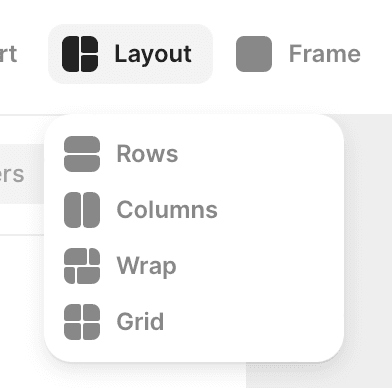
Grid’s behavior was another big hurdle for me to overcome in Webflow. At first, I’d assumed it would work similarly to Figma and Sketch. It kind of does, but not exactly. You can use a classic Bootstrap-style grid, where you determine the number of columns that the content must fit in. However, after finishing the “coding” of the entire page, I’d lean towards flex as the better solution between the two. It does a better job when it comes to making the website as responsive as possible.

Conclusion
So, where does this all leave us? Which solution should you go with? Let me put it like this:
Choose Framer if you’re looking for the simpler tool to start your no-code journey with.
Framer’s interface and general logic will be instantly recognizable to anyone who’s spent some time in Figma or Sketch. Learning to implement your design will be very simple and intuitive, and one of the most satisfying outcomes you can accomplish is deciding to move the entire design process to Framer. This way, you’ll be able to seamlessly transition from designing into prototyping, and when the project calls for it, even coding the final product.
Choose Webflow if you know some HTML & CSS.
Basic HTML and CSS skills will prove super helpful in making your first steps in Webflow. This knowledge, while in my opinion not exactly mandatory, will help you get the most out of the tool - making it a more attractive option than Framer. HOWEVER, if for any reason you end up choosing Webflow without any HTML & CSS background, don’t feel obliged to get familiar with those tools first. Simply start working on your first project, and learn those along the way.
I’m skipping over differences in pricing on purpose. Both Framer and Webflow offer multiple plans, and their relative value to you will largely depend on what you personally like to use in your day-to-day work. I’d recommend trying out the powerful free plans of both tools first, and then upgrading if needed once you get familiar with them.
Ask our experts
Feel free to ask us anything.
See also:
No-code is the future for web designers. Here’s why.
Karol Błędziński, Design Team Leader
Top 6 common mistakes that will ruin your website’s UX
Michał Pękala, Copywriter
Designing for men and women: what are the differences?
Karol Błędziński, Design Team Leader
Tags:
You may also like these posts
No-code is the future for web designers. Here’s why.
No-code solutions are all the rage now, but what do they mean to the designers? Should we also pay attention?
Karol Błędziński, Design Team Leader
Top 6 common mistakes that will ruin your website’s UX
Are you sure you’ve avoided the major mistakes that often destroy the users’ experience? Here's a checklist of the most common ones.
Michał Pękala, Copywriter
Designing for men and women: what are the differences?
How are men and women's brains built differently, and what are the real-world implications on design? Read on to find out!
Karol Błędziński, Design Team Leader
Subscribe to our newsletter
Get regular up-to-date insights from the world of e-commerce, web design, tech, digital marketing, and more. No spam, just useful and comprehensive content prepared by the experts from our team.
We could not send your email. Try again!
We already have your email in our mailing list.
You have been successfully subscribed to our newsletter!
By subscribing you confirm that you agree to the Terms of Use and Privacy Policy.